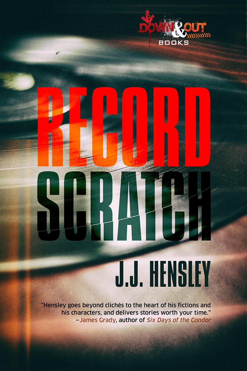
JJ Hensley: RECORD SCRATCH covered

It’s hard to tell which covers come easy and which take a ton of effort, but usually you can at least guarantee that doing a cover design for a sequel simplifies things. Usually. Theoretically just using same fonts and a roughly similar image will do the trick.
In case of JJ Hensley’s Trevor Galloway books, I shot the photographs for both, and came up with a layout that worked great for the first book, BOLT ACTION REMEDY:

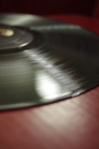
I shot a dozen setups for the sequel, thinking of contrasting the light/blue of the first volume with a darker scheme, and using the same font, but for some reason the cover wasn’t connecting in my eyes with the first book, whatever I did. Here’s the original photo I decided to use:

Now clearly it doesn’t have the option of laying out the text to one side as I had done before, but the simplicity of the image worked for me. I added some fairly subtle filters to the image, and I liked it better, yet I still wasn’t connecting the two books. So I grabbed the fence shadows out of BOLT ACTION REMEDY and laid them over the new photograph, and suddenly it all magically fused. It was subtle enough to go unnoticed, yet your brain works in mysterious ways and connects dots your reasoning mind doesn’t always notice:


Now I expect, if JJ writes a third volume, that I HAVE to use those same shadows again. Cover design 101. Should make it easier, right? Right.
RECORD SCRATCH can be pre-ordered on amazon right now.
But you might as well read BOLT ACTION REMEDY first.